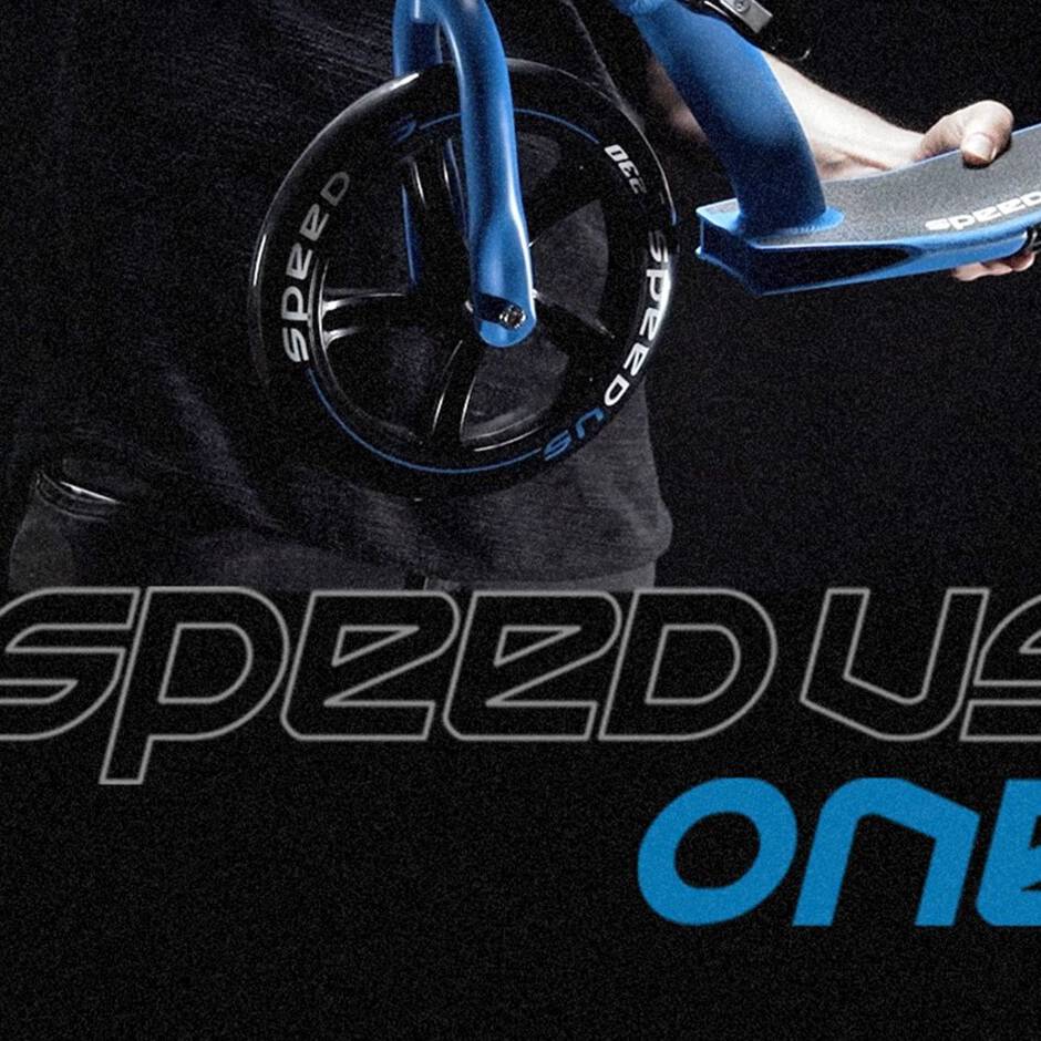

We have been working for Puky as external design force since the beginning of 1996. What initially started as a simple chaincover design project has evolved into a year-long design project on retainer. The LR1 running, the Babyracer and perhaps the small "Wutsch" bike stand out as three of our most iconic achievements during this Puky-Color design times. Unfortunately, we lost contact with Puky in 2008 due to legal obligations with our old partners. However, things turned in our favor some years later, and we were able to push the boundaries of Puky's design language even further. We created subbrands like Eightshot and the innovative foldable scooter family SpeedUs.
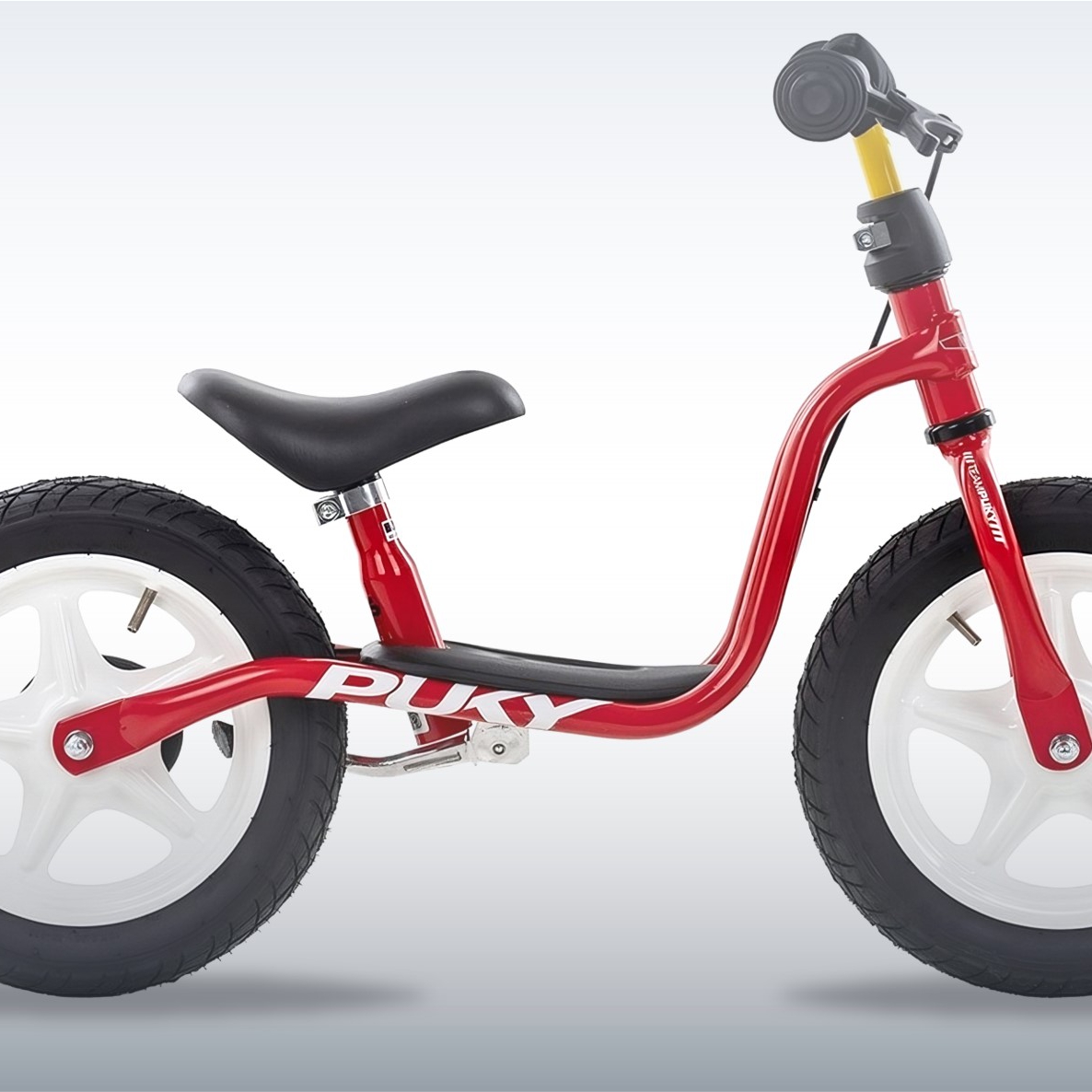
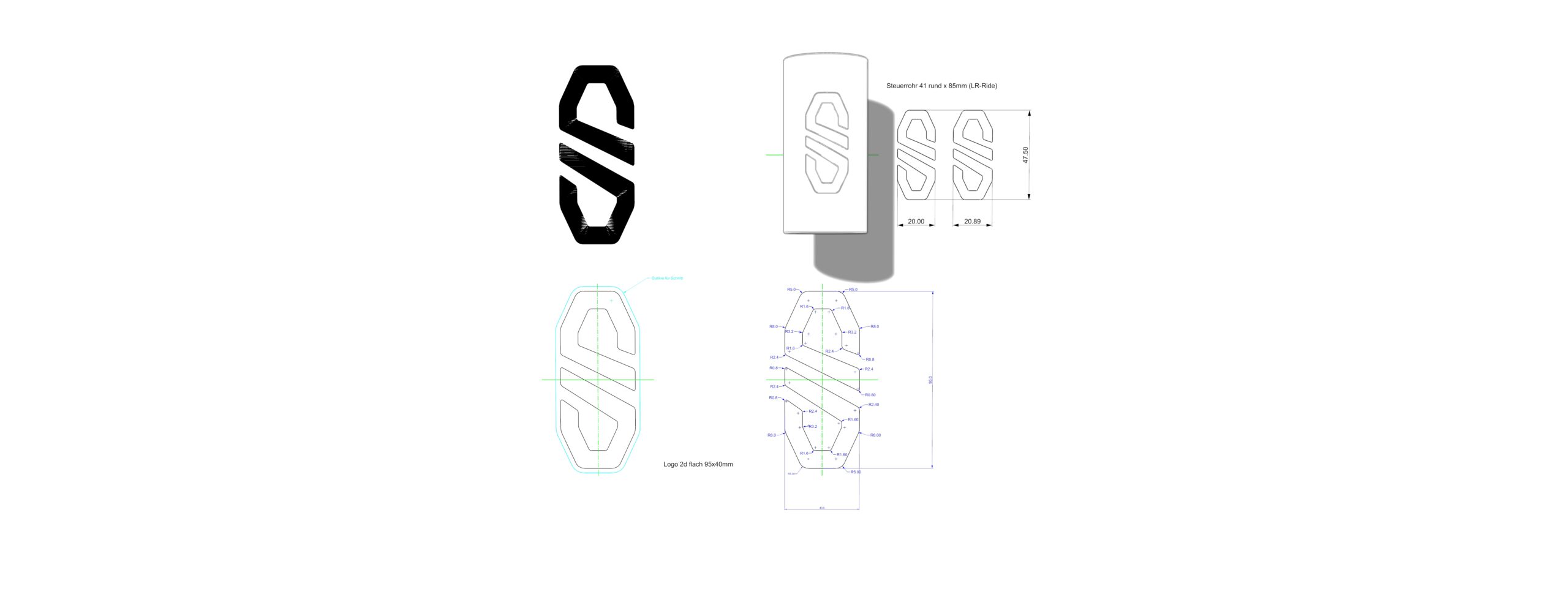
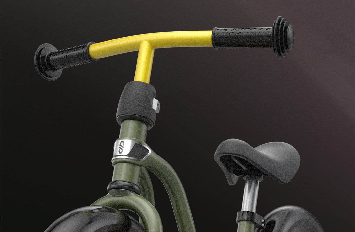
Throughout our work with Puky, the logo featuring an eight-edged coat of arms on the steering tube has always been held sacred. We never dared to touch it or complain about it, even if there where shy attempts all way long. While the original Puky logo is highly recognizable, it lacks distinction with its falling typography and the crowded white/red/black color scheme applied to a bike frame. Therefore, we were absolutely delighted when we were commissioned to design a new and fresh logo that would be best suited for placement on the steering tube of a modern classic bike.
The new design maintains the old proportions and the eight-edged outline shared by sister brand Eightshot. However, overall, the logo is much cleaner and ready for use in product, packaging and online applications. The simplified outline consists of two elements that resemble both the old logo and a dynamic winding road to a horizon. The iconic negative falling lines now appear slightly concentric, resembling rays of sunshine.
The new logo does not include any typography, allowing for more flexibility in arranging Puky's core elements in a modern style. This non-typographic laden badge evokes feelings of sun-filled streets and happiness – attributes that one should remember the happy times when riding their bike for the first time as a young child.
Closing this chapter of the Puky brand development with such a significant project brings us great joy. Redesigning the Puky Logo was one of our unspoken goals throughout all these years, and we are thrilled with how well it has turned out.